A YouTube banner for a faceless channel has one job:
Make the channel feel real before the viewer watches a video.
That sounds simple, but most faceless banners fail immediately.
They either look like a cheap AI wallpaper, a random gaming header, a generic “welcome to my channel” template, or a cluttered graphic with too much tiny text. The viewer lands on the channel page and instantly feels the brand is low-effort.
That is a problem.
A faceless channel does not have a creator’s face to build trust. The banner has to carry more weight. It needs to explain the channel promise, set the mood, support the niche, and make the whole channel feel intentional.
This guide gives you practical YouTube banner ideas for faceless channels, with examples by niche, layout formulas, tagline templates, design rules, and a checklist you can use before creating your next banner.
Key Takeaways
- A faceless YouTube banner should explain the channel promise quickly, not just look decorative.
- The best banners combine a clear tagline, strong visual mood, simple composition, and niche-specific trust signals.
- YouTube says banner images should be at least 2048 x 1152 pixels with a 16:9 aspect ratio, and the safe area for text and logos is 1235 x 338 pixels. Source: YouTube Help
- Faceless banners should avoid tiny text, fake creator photos, random AI characters, cluttered backgrounds, and generic phrases like “welcome to my channel.”
- Different niches need different banner styles. A finance banner should feel trustworthy. An AI news banner should feel sharp and futuristic. A mystery banner should feel cinematic and suspenseful.
- The fastest way to create a better banner is to define the channel promise first, then design the visuals around that promise.
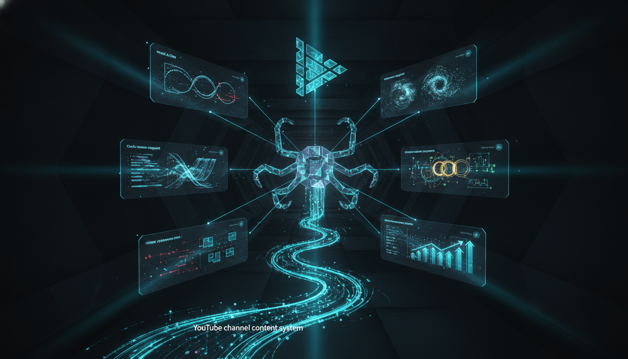
- OverseerOS can help creators analyze winning channels, understand proven brand patterns, and create logos, banners, thumbnails, and content workflows from a clearer strategy.
What Makes a Good Faceless YouTube Banner?
A good faceless banner answers three questions fast:
- What is this channel about?
- Who is this channel for?
- Why should I trust it enough to watch or subscribe?
That is the job.
Not “look cool.”
Not “fill the top of the channel page.”
Not “add a random AI image.”
A faceless banner should feel like a brand sign above a media company.
When a viewer lands on your channel page, the banner should make the channel feel:
- Clear
- Specific
- Trustworthy
- Consistent
- Niche-aware
- Professional
- Worth exploring
A weak banner makes the channel feel random.
A strong banner makes the channel feel intentional.
The Faceless Banner Formula
Use this formula for most faceless channels:
Channel name + clear tagline + niche-specific visual world + simple composition
That is it.
The banner does not need to explain the entire channel.
It needs to create immediate clarity.
Example
Channel name:
Future Signals
Tagline:
AI breakthroughs explained before they become obvious
Visual world:
Dark tech grid, signal lines, subtle glow, futuristic dashboard feel
This works because the viewer instantly understands:
- It is about AI.
- It is probably analytical.
- It is not a random meme channel.
- It has a clear editorial promise.
- It feels like a real channel brand.
Weak Example
Channel name:
AI Universe Hub
Tagline:
Subscribe for amazing videos
Visual world:
Random robot, lightning, galaxy, code, neon, floating icons
This feels generic because nothing is specific.
It could belong to 10,000 other channels.
YouTube Banner Size and Safe Area
Before talking design, get the format right.
YouTube recommends channel banner images that work across devices. According to YouTube Help, banner images should be at least 2048 x 1152 pixels with a 16:9 aspect ratio. YouTube also lists the minimum safe area for text and logos as 1235 x 338 pixels, and files should be 6 MB or smaller. Source: YouTube Help
That means your banner should be designed with cropping in mind.
Viewers may see it on:
- Desktop
- Mobile
- TV
- Tablet
- Different browser widths
The most important text and logo should stay in the safe center area.
Banner Safe Area Rule
Put these in the center:
- Channel name
- Tagline
- Logo
- Main brand promise
Keep these away from the edges:
- Important text
- Small icons
- Detailed visuals
- CTA lines
- Upload schedule
The edges can hold atmosphere.
The center should hold meaning.
The Best YouTube Banner Layouts for Faceless Channels
Do not start with colors.
Start with layout.
Here are the strongest banner layouts for faceless channels.
1. The Clean Brand Promise Banner
Best for:
- Education channels
- Finance channels
- AI channels
- Business channels
- Psychology channels
- Beginner-friendly niches
Structure:
Logo on the left
Channel name in the center
Short tagline under the name
Clean niche visuals in the background
Example:
Channel: Wealth Plainly
Tagline: Simple money decisions without hype
Visual: Minimal dark background, subtle chart lines, clean coin or vault icon
Why it works:
It gives instant clarity.
This layout is not trying too hard. It tells the viewer what the channel does and makes the brand look stable.
Template
[Channel Name]
[Short promise in 5 to 9 words]
Examples:
Future Signals
AI breakthroughs explained before they become obvious
Wealth Plainly
Simple money decisions without hype
The Human Pattern
Psychology behind behavior, attraction, and self-worth
2. The Cinematic Documentary Banner
Best for:
- History
- Mystery
- Business documentaries
- True crime style channels
- Dark AI documentaries
- Power and strategy channels
Structure:
Dark cinematic background
One strong symbolic object
Channel name in bold
Tagline with story tension
Example:
Channel: Empire Lessons
Tagline: Power, betrayal, and strategy from history
Visual: Old map, crown silhouette, smoke, gold/black lighting
Why it works:
It creates atmosphere.
Faceless documentary channels need mood. The banner should feel like the opening of a serious video.
Template
[Channel Name]
[Power / mystery / strategy promise]
Examples:
Empire Lessons
Power, betrayal, and strategy from the past
Dark Systems
The hidden forces behind modern power
The Strategy Vault
Business moves, failures, and power plays
3. The Modern Tech Dashboard Banner
Best for:
- AI tools
- Tech news
- Automation
- SaaS tutorials
- Creator tools
- Future-of-work channels
Structure:
Dark background
Abstract dashboard elements
Thin grid lines
Signal or data visuals
Clean futuristic typography
Short promise
Example:
Channel: AI Workflow Lab
Tagline: Turn AI tools into real systems
Visual: Dark SaaS dashboard, automation nodes, clean teal accents
Why it works:
It feels current without becoming a messy robot collage.
The mistake in AI channel banners is adding every cliché at once:
- Robot
- Brain
- Circuit board
- Neon blue glow
- Floating code
- Galaxy background
- AI face
That looks cheap.
A premium AI banner should feel controlled.
4. The Minimal Authority Banner
Best for:
- Finance
- Business
- Education
- Legal commentary
- Investing
- Productivity
- Expert-style faceless channels
Structure:
Plain background
Strong typography
Small logo
One clear tagline
Very few visual elements
Example:
Channel: Better Decisions
Tagline: Clear thinking for money, work, and life
Visual: Black background, sharp white type, one simple mark
Why it works:
Minimalism can build trust.
Especially in niches where hype creates suspicion.
A finance channel should not look like a crypto casino. A business channel should not look like a dropshipping ad. A serious education channel should not look like a clickbait content farm.
Clean can be powerful.
5. The Visual World Banner
Best for:
- Story channels
- Explainer channels
- Faceless entertainment
- Mystery
- History
- Science
- Space
- Philosophy
Structure:
Immersive world background
Channel name centered
Tagline over atmosphere
Visual objects related to the niche
Example:
Channel: Cosmic Questions
Tagline: Space, time, and the mysteries we still cannot answer
Visual: Deep space, subtle planet, dark blue lighting, minimal typography
Why it works:
The banner makes the channel feel like a universe.
This is good when the brand is less about “tips” and more about experience.
6. The Niche Object Banner
Best for:
- Finance
- History
- Psychology
- Mystery
- Science
- Business
- Self-improvement
Structure:
One strong object
Simple brand text
Short tagline
High contrast background
Examples:
- Finance: vault, coin, ledger, simple chart
- History: crown, map, sword, seal
- Psychology: eye, mirror, human silhouette, chess piece
- Business: chess piece, graph, briefcase, factory silhouette
- Mystery: keyhole, evidence board, shadow figure
- Self-improvement: shield, mountain, flame, stone statue
Why it works:
One object is easier to remember than ten.
A faceless channel needs recognition. A strong symbol helps.
YouTube Banner Ideas by Faceless Channel Niche
Use these as starting points.
Do not copy them blindly. Adapt the idea to your own channel promise.
| Niche | Banner Idea | Tagline Direction |
|---|---|---|
| AI news | Dark tech dashboard with signal lines | AI breakthroughs explained early |
| AI tools | Clean workflow board with automation nodes | Turn AI tools into real systems |
| Finance | Minimal vault or chart visual | Simple money decisions without hype |
| Investing | Clean market grid with calm typography | Long-term investing made clear |
| Psychology | Human silhouette with abstract pattern | Understand the hidden patterns behind behavior |
| Relationships | Split-light emotional silhouette | Attraction, attachment, and self-worth explained |
| History | Cinematic map, crown, or ancient seal | Power and betrayal from the past |
| Business | Premium editorial layout with chess piece | Strategy lessons from companies that win |
| Mystery | Dark evidence-board atmosphere | Strange stories and hidden motives |
| Self-improvement | Minimal mountain or shield symbol | Discipline, identity, and self-control |
| Space | Deep space visual with clean typography | The universe explained without fluff |
| Science | Abstract lab or diagram visual | Complex ideas made simple |
| Education | Clean diagram style with simple shapes | Learn faster with clear explanations |
| Faceless storytelling | Cinematic scene with bold promise | Stories that reveal human nature |
The banner should match the viewer’s expectation for the niche.
Finance should feel credible.
Mystery should feel suspenseful.
Education should feel clear.
AI should feel modern.
History should feel cinematic.
Banner Tagline Ideas for Faceless Channels
A tagline is usually the most important line on the banner.
It should be short.
Aim for 5 to 10 words.
AI Channel Taglines
AI breakthroughs explained before they become obvious
The future of work, decoded
AI tools, automation, and what changes next
Understand AI without the hype
Where AI trends become creator workflows
Finance Channel Taglines
Simple money decisions without hype
Build wealth with clear thinking
Investing explained for real beginners
Money lessons without scams or jargon
Smarter finance, one decision at a time
Psychology Channel Taglines
The hidden patterns behind human behavior
Attraction, attachment, and self-worth explained
Understand people without overthinking everything
Emotional patterns made clear
Psychology lessons for modern relationships
History Channel Taglines
Power, betrayal, and strategy from the past
History’s biggest decisions explained
Ancient stories with modern lessons
The past was never simple
Lessons from empires, kings, and collapse
Business Channel Taglines
Strategy lessons from companies that win
Business case studies without the fluff
How markets, founders, and timing create winners
The hidden moves behind modern business
Better business decisions through real stories
Self-Improvement Channel Taglines
Discipline, identity, and self-control
Hard truths for better men
Build yourself without motivational nonsense
The psychology of discipline and respect
Better habits. Stronger mind. Clearer life.
Mystery Channel Taglines
Strange stories. Hidden motives. Real questions.
The darker side of unsolved events
What happened, why it matters, what was missed
Mysteries explained without fake hype
The stories that still do not add up
What Not to Put on a Faceless YouTube Banner
A faceless banner should not look like a generic template.
Avoid these mistakes.
1. “Welcome to My Channel”
This is the weakest banner text.
It says nothing.
A viewer already knows they are on a channel.
Use that space to explain the promise.
Bad:
Welcome to my channel
Better:
AI breakthroughs explained before they become obvious
2. Too Much Tiny Text
Most viewers will not read a paragraph on your banner.
Keep text simple.
Use:
- Channel name
- Tagline
- Optional upload promise
That is enough.
3. Random AI Characters
AI-generated characters can work, but random mascots usually make the channel look cheap.
Avoid generic:
- Robot face
- Hooded hacker
- Fake business person
- Hyper-detailed avatar
- Unrealistic glowing eyes
- Random luxury man with no connection to the niche
Use symbols and visual systems instead.
4. Fake Luxury
This is common in finance and self-improvement channels.
Gold cars, cash piles, watches, mansions, and private jets often make the brand look less trustworthy, not more.
If your channel is about serious money education, use clarity instead of fake wealth.
5. Cluttered Backgrounds
A banner is a wide, cropped, responsive image.
If you add too many details, most of them will get lost.
Use one clear visual direction.
6. Mismatched Visual Style
Your banner should match your thumbnails.
If your banner is clean and premium but your thumbnails are chaotic, the channel feels disconnected.
The banner, logo, and thumbnails should feel like one system.
The Faceless Banner Design Checklist
Use this before creating or publishing your banner.
Clarity
- The banner explains what the channel is about.
- The tagline is specific.
- The viewer can understand the channel in 5 seconds.
- The banner does not rely on vague hype words.
- The niche is obvious without reading the About section.
Design
- The most important text is inside the safe center area.
- The logo is visible but not oversized.
- The channel name is easy to read.
- The tagline is short enough to scan.
- The background is not cluttered.
- The colors match the niche.
- The design works on desktop and mobile.
Brand Fit
- The banner matches the thumbnail style.
- The banner matches the voice of the channel.
- The banner matches the topic and audience.
- The banner feels like the same brand as the logo.
- The banner does not look like a random template.
Trust
- The banner avoids fake claims.
- The banner avoids misleading visuals.
- The banner does not look like low-effort AI content.
- The banner feels intentional.
- The channel promise feels believable.
The Best Color Styles for Faceless Banners
Color affects trust.
Do not choose colors randomly.
| Niche | Strong Color Direction |
|---|---|
| AI | Black, teal, blue, silver, violet accents |
| Finance | Black, white, green, navy, gold used carefully |
| History | Black, gold, brown, parchment, deep red |
| Psychology | Black, beige, dark blue, muted red, soft gradients |
| Business | Black, white, charcoal, gold, deep blue |
| Self-improvement | Black, grey, red, bronze, muted gold |
| Mystery | Black, dark red, smoky grey, deep blue |
| Space | Black, blue, purple, white, cosmic gradients |
| Education | White, navy, green, yellow, clean contrast |
| Science | White, blue, black, lab-style neutrals |
The color should support the mood.
AI can feel futuristic.
Finance should feel stable.
History should feel cinematic.
Psychology should feel emotional but not messy.
Banner Font Rules
Bad fonts can ruin a good banner.
A faceless channel should use fonts that match the niche.
| Niche | Font Direction |
|---|---|
| AI | Modern sans-serif, geometric, clean |
| Finance | Clean sans-serif or premium serif |
| History | Elegant serif, cinematic serif, engraved feel |
| Psychology | Soft sans-serif, editorial serif |
| Business | Premium sans-serif, sharp serif |
| Self-improvement | Bold condensed sans-serif |
| Mystery | Cinematic serif, narrow sans-serif |
| Education | Clean rounded sans-serif |
Rules:
- Do not use more than two fonts.
- Do not use thin fonts for tiny text.
- Do not use overly decorative fonts.
- Do not use all caps unless the brand needs intensity.
- Do not make the tagline too small.
- Test readability on mobile.
The banner should be read fast.
If the viewer has to zoom in, the design failed.
15 YouTube Banner Ideas for Faceless Channels
Here are practical banner concepts you can adapt.
1. The “Media Brand” Banner
Best for: AI, business, finance, commentary
Layout:
Logo + channel name + short editorial promise
Example:
Signal Brief
Clear breakdowns of AI, markets, and technology shifts
Visual style:
Dark editorial background, subtle grid, clean typography
Why it works:
It makes the channel feel like a real publication.
2. The “Documentary World” Banner
Best for: history, mystery, business documentaries
Layout:
Cinematic scene + channel name + high-stakes tagline
Example:
Empire Lessons
Power, betrayal, and strategy from the past
Visual style:
Maps, smoke, shadows, gold lighting, strong depth
Why it works:
It sells atmosphere before the viewer watches.
3. The “Clean Teacher” Banner
Best for: education, tutorials, science, finance
Layout:
Simple background + diagram elements + clear teaching promise
Example:
Explained Clearly
Complex ideas made simple
Visual style:
Clean shapes, simple icons, high readability
Why it works:
It builds trust through clarity.
4. The “Dark Tech” Banner
Best for: AI, automation, cybersecurity, future of work
Layout:
Abstract tech visuals + strong promise + clean logo
Example:
Future Signals
AI breakthroughs explained early
Visual style:
Dark interface, teal accents, signal lines, subtle glow
Why it works:
It feels modern without becoming messy.
5. The “Symbolic Object” Banner
Best for: psychology, self-improvement, finance, mystery
Layout:
One symbolic object + channel name + tagline
Example:
The Human Pattern
Behavior, attraction, and emotion explained
Visual style:
Mirror, chess piece, eye, vault, keyhole, flame
Why it works:
The object becomes a memory hook.
6. The “Case Study” Banner
Best for: business, startups, creator economy
Layout:
Editorial brand title + tagline + abstract business visuals
Example:
The Strategy Vault
Why companies win, fail, and disappear
Visual style:
Premium charts, chess pieces, founder silhouettes, clean type
Why it works:
It positions the channel as analytical.
7. The “No-Hype Finance” Banner
Best for: investing, personal finance, money education
Layout:
Minimal brand name + trust-based tagline
Example:
Wealth Plainly
Simple money decisions without hype
Visual style:
Clean chart lines, dark navy, soft green, minimal gold
Why it works:
It avoids the scammy finance look.
8. The “Emotional Psychology” Banner
Best for: relationships, attachment, human behavior
Layout:
Soft dark background + silhouette + emotional promise
Example:
Mindframe
The hidden patterns behind behavior
Visual style:
Human silhouette, abstract emotion lines, muted tones
Why it works:
It creates mood without fake drama.
9. The “High-Value Men” Banner
Best for: masculinity, discipline, status, dating, self-control
Layout:
Bold channel name + direct promise + minimal masculine symbol
Example:
Inner Standard
Discipline, status, and self-control
Visual style:
Black background, bronze or red accent, shield or mountain mark
Why it works:
It feels strong without looking like cheap motivation.
10. The “Space Mystery” Banner
Best for: space, philosophy, science mysteries
Layout:
Cosmic background + simple title + curiosity tagline
Example:
Cosmic Questions
Space, time, and the mysteries we still can’t answer
Visual style:
Deep space, subtle planet, clean glowing typography
Why it works:
It creates scale and wonder.
11. The “Breaking Analysis” Banner
Best for: news commentary, AI news, tech updates
Layout:
Channel name + fast analysis promise + subtle news-grid style
Example:
Update Decode
What happened, why it matters, what changes next
Visual style:
Dark newsroom style, signal lines, clean panels
Why it works:
It tells viewers the channel is about interpretation, not random news clips.
12. The “Myth-Busting” Banner
Best for: finance, health education, productivity, psychology
Layout:
Brand name + anti-hype tagline
Example:
Clear Thinking Lab
Better decisions without internet myths
Visual style:
Clean type, contrast, subtle broken-pattern graphic
Why it works:
It differentiates the channel from gurus.
13. The “Archive” Banner
Best for: history, documentaries, business lessons
Layout:
Archive-style background + channel name + serious promise
Example:
The Hidden Archive
Forgotten stories that explain modern power
Visual style:
Old documents, maps, film grain, warm shadows
Why it works:
It feels credible and story-rich.
14. The “Workflow” Banner
Best for: creator tools, AI productivity, automation
Layout:
Automation flow visual + channel promise
Example:
Workflow Engine
Build faster systems with AI tools
Visual style:
Connected nodes, dashboard cards, clean tech layout
Why it works:
It shows the channel is practical.
15. The “One-Line Promise” Banner
Best for: almost any faceless channel
Layout:
Huge channel name + one unforgettable promise
Example:
Better Decisions
Think clearer. Choose smarter. Waste less time.
Visual style:
Minimal, high contrast, strong typography
Why it works:
It is simple and memorable.
Banner Ideas by Channel Type
Use this table when choosing a direction.
| Channel Type | Best Banner Style | Avoid |
|---|---|---|
| AI news | Dark tech dashboard | Generic robot collage |
| Finance | Minimal authority | Cash piles and fake luxury |
| History | Cinematic documentary | Cartoon history graphics |
| Psychology | Emotional symbolic | Random brain icons everywhere |
| Business | Premium editorial | Dropshipping-style hype |
| Mystery | Dark cinematic | Overly fake horror visuals |
| Education | Clean diagram style | Cluttered classroom template |
| Self-improvement | Bold minimal | Cringe motivational quotes |
| Space | Cinematic cosmic | Overloaded galaxy wallpaper |
| Creator tools | SaaS workflow style | Random app screenshots |
The right style depends on viewer expectation.
A banner should not just be “pretty.”
It should feel right for the niche.
Copy-Ready Banner Prompts
Use these prompts to generate or brief a banner designer.
AI Faceless Channel Banner Prompt
Create a premium YouTube banner for a faceless AI channel called [Channel Name]. The channel explains AI breakthroughs, tools, and automation trends before they become obvious. Use a dark futuristic tech style with clean dashboard elements, subtle signal lines, teal accents, and strong readable typography. Include the tagline: “[Tagline].” Keep the center safe area clean for text and logo. No robot face, no clutter, no readable fake UI text, no real platform logos.
Finance Faceless Channel Banner Prompt
Create a trustworthy YouTube banner for a faceless finance education channel called [Channel Name]. The channel teaches simple money decisions, investing basics, and wealth-building without hype. Use a clean premium style with dark navy, white, muted green, subtle chart lines, and minimal visual elements. Include the tagline: “[Tagline].” Keep the design professional, calm, and readable. No cash piles, no luxury cars, no fake millionaire imagery.
History Faceless Channel Banner Prompt
Create a cinematic YouTube banner for a faceless history channel called [Channel Name]. The channel tells stories about power, betrayal, strategy, and the lessons of the past. Use a dramatic historical style with old maps, warm gold lighting, dark shadows, subtle texture, and premium typography. Include the tagline: “[Tagline].” Keep text inside the center safe area. No cartoon style, no clutter.
Psychology Faceless Channel Banner Prompt
Create a premium YouTube banner for a faceless psychology channel called [Channel Name]. The channel explains attraction, attachment, behavior, self-worth, and emotional patterns. Use a dark elegant background with a subtle human silhouette, abstract pattern lines, soft contrast, and calm readable typography. Include the tagline: “[Tagline].” The mood should feel intelligent, emotional, and trustworthy. No cheesy brain icons, no medical clichés.
Business Faceless Channel Banner Prompt
Create a premium editorial YouTube banner for a faceless business case study channel called [Channel Name]. The channel explains strategy, timing, leverage, founders, and why companies win or fail. Use a clean dark business aesthetic with subtle charts, chess-inspired strategy elements, sharp typography, and a premium media-brand feel. Include the tagline: “[Tagline].” No fake office stock photos, no clutter.
Mystery Faceless Channel Banner Prompt
Create a cinematic YouTube banner for a faceless mystery channel called [Channel Name]. The channel covers strange stories, hidden motives, unanswered questions, and suspicious events. Use a dark atmospheric style with shadow, evidence-board elements, subtle red accents, and strong readable typography. Include the tagline: “[Tagline].” Keep it suspenseful but not cheesy. No horror gore, no fake faces.
How to Make a Banner Look Professional Without Overdesigning
Professional does not mean complicated.
Most banners improve when you remove things.
Use this rule:
One message. One mood. One main visual system.
Do not combine:
- Robot + galaxy + money + face + chart + text wall
- Ancient map + fire + crown + sword + 7 portraits
- Brain icon + heart + couple + quotes + emojis
- Business chart + city skyline + founder + stock market + laptop
A banner is not a poster.
It is a brand header.
Simplify until the promise is obvious.
How Your Banner Should Connect to Thumbnails
Your banner is not separate from your thumbnail system.
It should feel like the parent brand.
If your thumbnails are dark, cinematic, and intense, the banner should not be soft pastel.
If your thumbnails are clean educational diagrams, the banner should not be a dramatic movie poster.
If your thumbnails are premium business editorial, the banner should not look like gaming neon.
The connection should show through:
- Color palette
- Font style
- Mood
- Icon style
- Visual texture
- Contrast level
- Topic promise
A viewer should feel:
“Yes, these videos belong to this channel.”
That is branding.
How OverseerOS Helps You Build Better YouTube Banners
The best banner does not start inside a design tool.
It starts with strategy.
You need to know what kind of channels already work in your niche, what visual styles viewers respond to, what promises successful channels make, and how your channel can create its own unique version.
That is where OverseerOS fits.
OverseerOS helps creators reverse-engineer successful YouTube channels, analyze what works, study title and thumbnail patterns, and turn proven patterns into a repeatable content workflow.
For branding, OverseerOS also supports brand asset creation workflows, including logo and banner generation. That helps creators create custom channel visuals, text overlay options, and brand-aligned assets instead of relying on random templates.
Use the OverseerOS YouTube growth platform if you want to study proven channel patterns before building your brand.
Use the AI YouTube thumbnail generator if your next priority is creating a consistent thumbnail system that matches your banner and channel identity.
The goal is not to copy another channel.
The goal is to understand what already works, then build a brand that feels clear, original, and trustworthy.
20-Minute YouTube Banner Workflow for Faceless Channels
Use this before creating a banner.
Minute 0 to 3: Define the Channel Promise
Write:
This channel helps [audience] understand [topic] through [angle].
Example:
This channel helps creators understand AI tools through practical workflow breakdowns without hype.
Minute 3 to 6: Pick the Banner Style
Choose one:
- Clean brand promise
- Cinematic documentary
- Modern tech dashboard
- Minimal authority
- Visual world
- Niche object
Minute 6 to 9: Write the Tagline
Use 5 to 10 words.
Examples:
AI breakthroughs explained before they become obvious
Simple money decisions without hype
Power, betrayal, and strategy from the past
Minute 9 to 12: Choose the Visual System
Define:
- Background mood:
- Main colors:
- Accent color:
- Symbol or object:
- Font style:
- Texture:
- Level of drama:
Minute 12 to 15: Check the Safe Area
Keep the important elements centered:
- Logo
- Channel name
- Tagline
Do not place critical text near the edges.
Minute 15 to 20: Compare Against Your Thumbnails
Ask:
- Does the banner feel like the same channel?
- Do the colors match?
- Does the mood match?
- Does the promise match?
- Would a new viewer understand the niche?
If not, simplify.
YouTube Banner Checklist Before Publishing
Use this final checklist.
- The banner explains the channel promise.
- The tagline is specific.
- The channel name is readable.
- The most important text sits in the safe area.
- The design works on mobile and desktop.
- The banner matches the logo.
- The banner matches the thumbnail style.
- The colors fit the niche.
- The background is not cluttered.
- The design avoids generic AI visuals.
- There is no tiny unreadable text.
- The banner does not say “welcome to my channel.”
- The channel feels trustworthy.
- The viewer can understand the channel in 5 seconds.
Common YouTube Banner Mistakes
Mistake 1: Making the Banner Decorative Instead of Strategic
A pretty banner that says nothing is not enough.
The banner should explain the channel’s promise.
If it only looks nice, it is not doing its job.
Mistake 2: Using a Generic AI Background
AI-generated banners often look impressive at first glance but generic after one second.
Too many glowing shapes, fake dashboards, robots, planets, or random patterns make the channel look mass-produced.
Prompt for strategy, not decoration.
Mistake 3: Adding Too Much Text
A banner is not an About page.
Keep the text short.
Use the About section for longer explanation.
Mistake 4: Forgetting Mobile Cropping
A banner can look good on desktop and fail on mobile.
Keep important text in the center safe area.
Do not design only for your own screen.
Mistake 5: Copying Another Channel Too Closely
Modeling is smart.
Copying is weak.
Study the patterns, but create your own visual direction.
Mistake 6: Mismatching the Banner and Thumbnails
If the banner and thumbnails feel like two different brands, the channel looks unfinished.
The banner should set the visual rules for the channel.
Final Verdict
A YouTube banner for a faceless channel is not just decoration.
It is a trust signal.
It tells viewers what the channel is about, what kind of content they can expect, and whether the channel feels worth watching.
The best faceless banners are clear, simple, niche-aware, and consistent with the rest of the brand. They use a strong tagline, readable text, safe-area-aware layout, and visuals that match the channel’s promise.
Do not make a banner that says “welcome to my channel.”
Make a banner that says:
“This is exactly the kind of channel you were looking for.”
That is how a faceless channel starts to feel like a real brand.
FAQ
What should I put on a YouTube banner for a faceless channel?
A faceless YouTube banner should include your channel name, a short tagline, and visual elements that match your niche. The tagline should explain what viewers get from the channel. Keep the design simple and readable.
What is the best YouTube banner size?
YouTube says banner images should be at least 2048 x 1152 pixels with a 16:9 aspect ratio. The safe area for text and logos is 1235 x 338 pixels, and the file size should be 6 MB or smaller. Source: YouTube Help
How do I make a faceless YouTube banner look professional?
Use one clear channel promise, one strong visual style, readable typography, and a simple layout. Keep the most important text in the center safe area. Avoid clutter, tiny text, fake luxury visuals, and random AI-generated backgrounds.
Should my YouTube banner include an upload schedule?
Only include an upload schedule if you can keep it. A broken promise like “new videos every day” can make the channel look abandoned if you stop. For many faceless channels, a strong tagline is more useful than an upload schedule.
What is a good tagline for a faceless YouTube channel?
A good tagline explains the channel promise in 5 to 10 words. Examples: “AI breakthroughs explained before they become obvious,” “Simple money decisions without hype,” or “Power, betrayal, and strategy from the past.”
Can I use AI to create a YouTube banner?
Yes, AI can help create YouTube banners, but the output is only strong if the prompt includes a clear channel promise, niche, visual mood, tagline, and safe-area requirements. Generic prompts usually create generic banners.
Should my banner match my thumbnails?
Yes. Your banner, logo, and thumbnails should feel like one brand system. They do not need to look identical, but they should share colors, mood, typography, and visual style.
What should I avoid in a faceless YouTube banner?
Avoid “welcome to my channel,” tiny text, random AI avatars, generic robot images, cluttered backgrounds, fake luxury visuals, misleading claims, and designs that do not match your thumbnails.
What are the best banner ideas for AI faceless channels?
Strong AI banner ideas include dark tech dashboards, signal lines, automation nodes, clean interface visuals, futuristic typography, and taglines like “AI breakthroughs explained before they become obvious” or “Turn AI tools into real systems.”
Can OverseerOS help with YouTube banners?
Yes. OverseerOS helps creators study successful channels, understand proven content and visual patterns, and build better creator workflows. It also supports brand asset workflows such as logo and banner generation, helping creators create visuals that match their channel positioning instead of starting from random templates.